Let’s put the “fun” back in functional.
CASE STUDY: ONLINE EDUCATION SERVICES
UK-TEFL prepares English teachers for the adventure of a lifetime, but their clunky old Wordpress site was making it impossible to refresh their stale branding and outdated approach. They wanted to move over to Squarespace, but couldn’t afford to lose their existing Shopify e-commerce functionality and SEO rankings.
It’s exactly the kind of challenge we love.
Project Details:
-
UK-TEFL provides education and mentorship for people who are beginning their career journeys as English teachers abroad. Their courses, hosted in person and online, provide the necessary certification to qualify for most Teaching English as a Foreign Language (TEFL) jobs, and their experienced advisors offer additional personalized support for job-seekers.
When they approached us to re-build their website, the delightful and impressively organized UK-TEFL team was suffering from a very common problem: a cumbersome, outdated WordPress website that they didn’t feel confident about anymore. Even though UK-TEFL has a fantastic reputation in their niche, their competitors had begun to leave them behind, simply because their web presence didn’t meet current internet users’ high expectations of clear messaging and seamless UX. The site had many strange and frustrating dead ends that could easily exasperate even the most motivated customers before they had a chance to complete a purchase.
Sitting on top of all these tech troubles was also a glaring problem with branding and messaging. A quick glance at the home page should always immediately clarify exactly what value an organization offers, and in turn, the brand identity should reinforce that message with design choices that show more about the organization’s personality. But on the old UK-TEFL website, these basic principles of effective communication with online audiences were getting lost in a busy mess of text blocks with weak calls to action and a logo that had nothing to do with their business.
-
With this redesign, the UK-TEFL team hoped to preserve the handful of things that were working well about their business logistics – especially their existing Shopify products and Zendesk ticketing system – while also making big improvements in weaker aspects of their online presence.
We needed to be sure that our messaging choices would allow UK-TEFL’s primarily college-aged target market to instantly recognize themselves as the “hero” of an exciting and relatable narrative. TEFL certification offers the thrill of globetrotting adventure – available even to people of modest financial means! – and we wanted to instantly inspire website visitors with the thought of this advantage.
We also wanted to create a new visual brand identity that would appeal to the 90’s-inspired aesthetic sensibilities of the target audience. Gen Z loves bright color blocks and bubbly effervescence, and these were the aspects of UK-TEFL’s mood board that we focused on capturing.
Another important goal was to ensure that the system for creating new job posts, blog articles, and course listings was straightforward enough for an intern to watch our tutorial video and essentially have everything they needed to succeed.
-
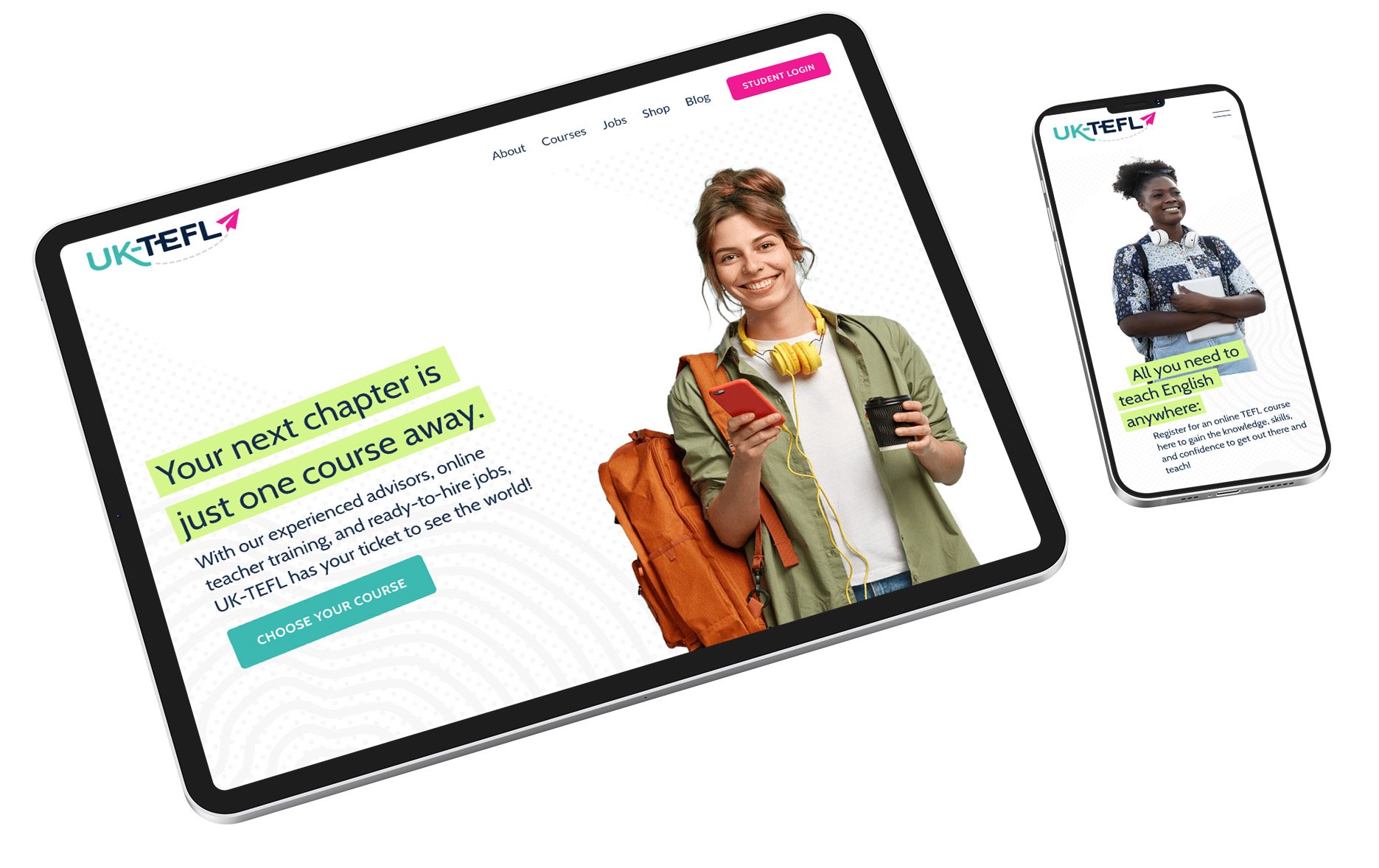
The first thing that we needed to inform design choices throughout the build was a new logo. We actually agonized over this part, trying out at least 5 completely different looks and color schemes before settling on the cheerful, iconic image that finally won everyone over. We think all those hours obsessing over which airplane graphic and dotted line style to use really paid off. The bright, clean color blocks and gradients that appear in icons and backgrounds throughout the site came together around the look and color palette that was established with the new logo.
When crafting the overall message for the home page, we leaned heavily into our practice of using the StoryBrand framework, developed by Donald Miller. In the conversations and brand development questionnaires we shared with the client about the unique value of UK-TEFL’s offer, a few areas of the StoryBrand script stood out most:
UK-TEFL’s advisors’ position as experienced, empathetic guides who can help aspiring TEFL teachers to avoid failure by removing obstacles to their success – especially the confusion and indecision these future educators are typically experiencing. Thus, we mentioned “ready-to-hire jobs” right at the top, along with the simplest possible 3-step explanation of the certification and job hunt process.
The website visitors’ aspirational identity, represented by the images and descriptions of adventure that awaits them – if only they get started with UK-TEFL’s straightforward self-paced online course!
For the online course shop, we used a bit of code to integrate the beautifully redesigned Squarespace blog posts for each course with the existing Shopify products, creating a seamless cart experience with a built-in feel.
We condensed the walls of text that had previously made the job posts overwhelming to read by using accordions. These provided a bit of summary and navigation. For the thumbnails, we curated a stunning set of photos of all the far-flung TEFL job locations across the globe to really hook the aspiring travelers.
This site ended up with three different instances of Squarespace’s highly dynamic blog module, but each one has its own distinct character and template design.
And after the simplified site architecture and content structure was fully realized, we went to work optimizing the site’s meta-data for search engines based on our keyword research, and also carefully creating redirects to minimize lost traffic in the re-launch.
And finally, we prepared our signature post-launch offering: a private page dedicated to custom website maintenance tutorial videos that administrators can refer back to for years to come.
-
The new UK-TEFL brand and website are some of our favorite aesthetic creations yet, and the site’s new UX and search engine optimization specs seem to be working out very well for conversions and bounce rates. By cleaning up the different visitor journeys through the site and making the whole thing more search engine-friendly, we made the process of becoming a UK-TEFL customer a friction-free experience, so the team can focus on continuing to provide the awesome educational materials and coaching that they do best.
The hundreds of organic visitors who file in from search engines every month since re-launching represent an improved, stabilized presence on Google that actually matches the company’s true authority in this field. And we’re delighted to see that our pals over in the UK-TEFL marketing department are absolutely killing it with regular high-value content updates that look great and follow the protocols we trained them to use. Check out some of their recent blog posts!
Highlights:
- New Logo & Branding
- Custom Squarespace Design
- Seamless Shopify Integration
- Search Engine Optimization
- Custom training videos
“LightPress was fantastic throughout our rebranding and the creation of our new website.”
“They were incredibly patient and thorough, from creating a new logo to launching our new website design. We love everything and cannot recommend them enough - thank you so much!”
— Kitt Chabba, UK-TEFL

Read More Case Studies